Housing Organization Websites: Why Clarity Beats Polish
By Brittany Hill · September 11, 2026
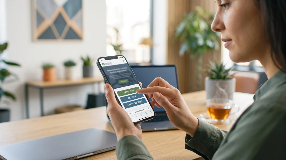
Most people who land on a housing organization's website aren't browsing. They're searching — for an application, a resource, someone who can actually help — and they're often doing it on one of the harder days of a hard search. That changes what the design is for.
A restaurant's website gets to be atmospheric. It can take its time setting a mood. A housing organization's website doesn't have that luxury, and honestly shouldn't want it. Its whole job is getting someone to the answer or the action they need, with zero friction, as fast as the page can manage.
What "polish" gets wrong
Polish, on its own, optimizes for how a site looks in a portfolio. Clarity optimizes for whether a stressed, time-pressed visitor actually finds what they came for. Those aren't opposites — a site can be both — but when you have to choose, choose clarity every time.
That was the guiding idea behind our work with the Northern Virginia Affordable Housing Alliance (NVAHA), a leading advocate for equitable, affordable housing in the region. Rather than starting from "what looks impressive," we started from "what does someone need to understand in the first ten seconds."
What we actually built
The brand itself needed to feel approachable rather than institutional — a clean, geometric logo mark representing the range of affordable housing options across Northern Virginia, paired with a soft, welcoming color palette instead of the colder, more corporate feel a lot of advocacy organizations default to.
The website followed the same logic. We used playful geometric shapes and carefully chosen imagery to bring NVAHA's mission and initiatives to life — not as decoration, but as a way of making dense policy and advocacy content feel approachable instead of overwhelming. The goal throughout was a site that educates and connects, not one that just looks credible from a distance.
The pattern worth borrowing
If you run a housing organization — or any mission-driven org where visitors arrive under real pressure — a few things matter more than visual trend-chasing:
- 01Say what you do in the first sentence a visitor reads, not the third paragraph
- 02Put the most time-sensitive action — apply, get help, contact us — somewhere a stressed visitor doesn't have to hunt for it
- 03Use warmth deliberately, not as an afterthought. Color, imagery, and shape can make dense or difficult content feel more approachable without ever going soft on the substance
- 04Test your site the way your actual visitor uses it — quickly, under pressure, often on a phone, often for the first time
Try This
Ask someone unfamiliar with your organization to find one specific thing on your site — how to apply for a program, or how to reach a specific staff member — and time how long it takes. If it takes longer than you'd want a stressed visitor to spend, that's not a content problem. That's a structure problem, and it's fixable.
One Last Thought
A housing organization's website isn't there to win a design award. It's there to be the calmest, clearest thing standing between someone and the help they're looking for. Get that right, and it usually ends up looking good anyway — clarity has a way of doing that.
Working on a housing or advocacy organization's brand or site? Let's talk about what clarity-first design would look like for your visitors. Curious how this played out for NVAHA specifically? See the full case study.
Book a Discovery Call →Continue Exploring
Service
WEBSITE DEVELOPMENT
We offer a complete suite of web development services tailored to your needs. From custom websites and powerful e-commerce platforms to high-performing landing pages and ongoing maintenance and hosting, we design, build, and manage websites that are as smart as they are stunning.
Case study
Northern Virginia Affordable Housing Alliance
We partnered with the Northern Virginia Affordable Housing Alliance (NVAHA) — a leading advocate for equitable, affordable housing — to develop a fresh, approachable brand that reflects their mission of creating homes and communities for all. From a clean, geometric logo representing the diversity of housing options to a soft, user-friendly color palette and immersive website experience, our work brings clarity, accessibility, and connection to the brand.
Next step
Start a Project
Tell us what you need. We typically respond within one business day.
Let's build it
Start a Project
If this article sparked a next step, tell us what you need. We typically respond within one business day.
Start a Project