Everyone in Your Industry Looks the Same. Here's How Not To.
By Brittany Hill · September 25, 2026
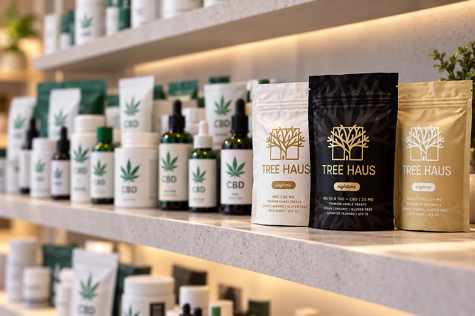
Go look at any crowded industry — hemp, skincare, fitness apps, whatever — and you'll notice something a little embarrassing: half the brands look like they hired the same designer, and the other half look like they're trying so hard not to that they overcorrected into chaos. There's rarely a middle. That gap in the middle is where the actual money is.
Tree Haus walked straight into that gap on purpose, and it's worth breaking down exactly how.
The two traps everyone falls into
In crowded categories, brands tend to sort into one of two lazy defaults. Option one: go clinical, sterile, borderline pharmaceutical — technically credible, forgettable on sight. Option two: lean hard into category cliché — for hemp, that's neon greens and the same seven-point leaf every competitor already used up. Neither wins. One reads as generic, the other reads as everyone else's knockoff.
Tree Haus needed to do neither. The brief was blunt: launch a premium hemp brand that didn't look like a pharmacy or a dorm-room poster, in a market that's genuinely allergic to good taste.
What "elevated" actually looked like in practice
We built a custom icon around a structured tree — not the seven-point leaf every competitor defaults to — signaling wellness without the stigma that comes bundled with the obvious symbol. Color moved away from the neon greens the whole category leans on, toward tones that read more interior-design-magazine than head-shop. Typography paired heritage serifs with clean sans-serifs, so it could sit comfortably next to a skincare line or a boutique hotel and not flinch.
Packaging did even more of the heavy lifting. Industry data says 72% of consumers make purchase decisions based on packaging alone — so we built a "chromatic hierarchy" where deep blacks signal Nighttime, warm ambers signal Daytime, neutrals signal Anytime, cutting the thinking a shopper has to do standing in an aisle. Matte finishes and gold foil did the tactile part; even the mandatory lab-testing QR code got folded into the design instead of slapped on as an afterthought.
None of this was decoration for its own sake. It was engineered to work inside a genuinely brutal constraint: no Meta or Google ads allowed in this category, so the packaging, the website, and organic search had to carry the entire growth story.
Why "systems" beat "assets"
The real shift wasn't visual, it was structural. Instead of a logo plus some one-off assets, Tree Haus got identity, packaging, ecommerce, and marketing built as one connected system from day one — designed to scale from three SKUs to thirty without a rebrand somewhere around SKU twelve. Brands that invest in a system instead of a logo see meaningfully higher retention with younger consumers, because consistency is doing quiet work every single time someone sees the brand again.
Try This
Pull up three competitors in your space, side by side. If you covered the logos, could you still tell them apart? If the honest answer is "not really," you don't have a design problem — you have a sameness problem, and no amount of logo tweaking fixes that. The fix lives in the system underneath: color logic, materials, tone, structure. Start there.
One Last Thought
In a crowded market, "different" beats "better" almost every time — mostly because "better" requires someone to compare you closely enough to notice, and most people never will. Different gets noticed in the three seconds you actually get.
Competing in a market where everyone's starting to look identical? Let's talk about building a system, not just a logo. Want the full breakdown of how Tree Haus pulled it off? See the case study.
Start a Project →Continue Exploring
Service
BRANDING & DESIGN
From bold brand identities to custom graphics with personality, we combine strategy, creativity, and functionality to create designs that make people stop and pay attention. Whether you need a full brand refresh, custom graphics, or scroll-stopping animations, let us help bring your unique vision to life.
Case study
Tree Haus
Tree Haus approached us with a high-stakes ambition: to launch a hemp-derived brand that felt as elevated as the product itself. In a market flooded with "me-too" aesthetics and "green-rush" marketing, they needed a premium cannabis brand identity that was refined, trustworthy, and—crucially—built for long-term scalability. They had the vision; we built the ecosystem to support it. From strategic hemp packaging design to a high-performance ecommerce engine, we positioned Tree Haus not just as a product, but as a market leader in the luxury wellness space.
Next step
Start a Project
Tell us what you need. We typically respond within one business day.
Let's build it
Start a Project
If this article sparked a next step, tell us what you need. We typically respond within one business day.