Your Brand Lives in More Places Than Your Logo Does
By Brittany Hill · September 24, 2026
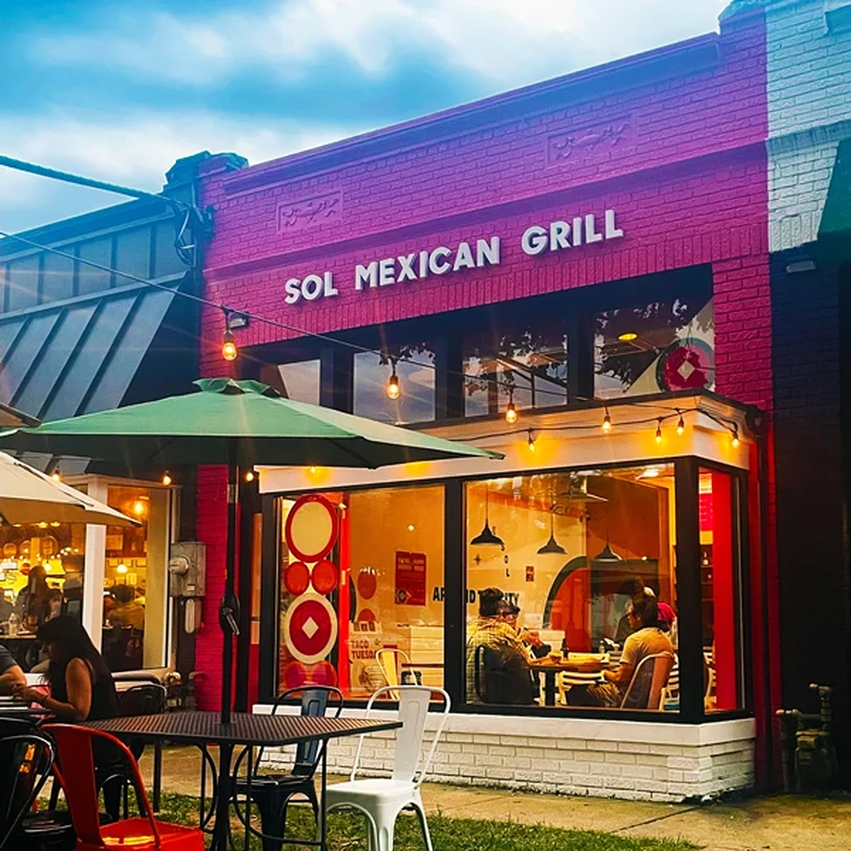
Picture the last time you drove past a restaurant and thought, without even reading the sign, "oh, that place feels fun." That reaction didn't come from a logo. It came from the paint color on the building, the font on the window decals, the way the patio furniture looked like somewhere you'd actually want to sit. Your brain built the whole impression before you were close enough to read a single word.
That's the part restaurant owners forget when they think "rebrand" means "new logo, same everything else." A logo is one signature on a much longer document.
SOL Mexican Grill figured this out from the outside in
When SOL Mexican Grill came to us, the food was already doing its job — bold flavors, a build-your-own menu, the kind of place with a real following. What wasn't matching that energy was, well, everything around it. So instead of starting with a logo tweak, we started with the building itself.
Storefronts got painted in a genuinely bold SOL pink — the kind of color you can't scroll past on a busy street. Interiors got refreshed with brighter colors, curated furnishings, and decor that actually looked like the food tasted. Then we carried that same energy into a social media push, custom flyers, and partnership campaigns designed to make the brand feel as shareable online as it already was in person.
Every single touchpoint — storefront, interior, feed — got pulled into the same story instead of being handled as five separate little projects.
The touchpoints people actually forget
If you're a restaurant owner nodding along, here's the inventory most brand refreshes conveniently skip:
- 01The building itself — exterior paint, signage, window treatment
- 02The room — furniture, lighting, wall art, the stuff people photograph without meaning to
- 03The menu — not just the food descriptions, the actual design of the object in someone's hands
- 04What shows up on a phone — social posts, delivery app photos, the two seconds someone scrolls past your account
A logo redesign that stops at the logo leaves three of those four completely untouched. Customers notice the mismatch even when they can't name it.
Try This
Stand across the street from your own restaurant — or pull up a street-view photo if you're feeling lazy — and look at it the way a stranger would, with zero context. Does the outside promise the same experience the inside delivers? If there's a gap between "looks like a place that serves okay tacos" and "this is actually SOL," that gap is exactly where a brand refresh earns its keep.
One Last Thought
Nobody falls in love with a restaurant because of its logo. They fall for the whole feeling — the color as they walk up, the room, the photo they didn't plan to take. Get the logo right and stop there, and you've decorated one wall in a house that still needs the rest of the renovation.
Own a restaurant or retail space that feels a little behind the food (or product) it's selling? Let's talk about what a full brand refresh would touch — inside and out. Want to see the SOL transformation in full color? Check out the case study.
Start a Project →Continue Exploring
Service
BRANDING & DESIGN
From bold brand identities to custom graphics with personality, we combine strategy, creativity, and functionality to create designs that make people stop and pay attention. Whether you need a full brand refresh, custom graphics, or scroll-stopping animations, let us help bring your unique vision to life.
Case study
SOL Mexican Grill
We partnered with SOL Mexican Grill, a modern fast-casual restaurant chain with locations throughout the Washington, D.C. area, to refresh and unify their brand across every touchpoint. Known for their bold flavors, create-your-own menu, and lively atmosphere, SOL was ready for a look that felt just as vibrant and inviting as the food they serve.
Next step
Start a Project
Tell us what you need. We typically respond within one business day.
Let's build it
Start a Project
If this article sparked a next step, tell us what you need. We typically respond within one business day.