5 Signs It's Time to Redesign Your Logo (And How It Impacts Your Perceived Value)
By Brittany Hill · June 9, 2026
A great logo should seamlessly grow alongside your business.
Yet, many highly established companies find themselves relying on visual assets designed years ago—long before they expanded their service suites, refined their market positioning, or matured into the sophisticated organization they are today.
The consequence? A fragmented visual identity that actively devalues the underlying quality, professionalism, and pricing of the brand it represents.
A strategic logo redesign is never about chasing transient design trends. It is an intentional engineering process to ensure your most visible brand asset accurately communicates who you are today and commands the authority you need for tomorrow.
Here are five unmistakable indicators that your organization has outgrown its current logo.
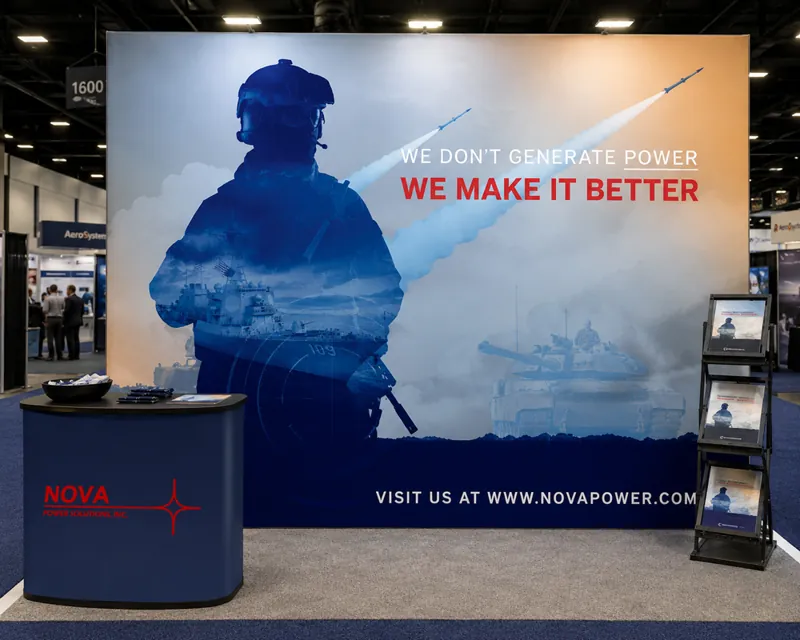
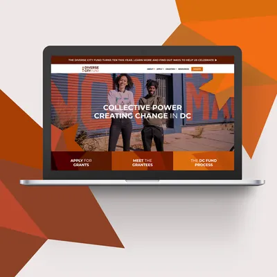
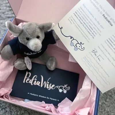
Looking for visual inspiration? Explore our recent branding and case studies to see how custom visual identity systems help modern organizations stand out, build trust, and scale.
View Branding Case Studies →The 5 Indicators of an Outgrown Brand Identity
1. Your Logo Looks Chronologically Dated
Design trends evolve, and certain graphic execution styles instantly pin a brand to a specific era. Heavy drop shadows, faux-3D gradients, overly complex illustrative shapes, or hyper-trendy typography can unintentionally signal to buyers that your operations are just as outdated as your visuals.
First impressions are cemented within milliseconds. If your logo feels stuck in the past, prospective clients will question your modern capabilities before reading a single line of your proposals. Ask yourself:
- 01Does our primary lockup feel genuinely current?
- 02If we launched today, would we dream of designing it this way?
- 03Does the visual aesthetic match the premium quality of our modern delivery?
2. Your Business Has Evolved Past Its Original Visual Framework
Most foundational logos are drafted during the initial startup phase when capital is tight and long-term directions are speculative. But successful businesses scale. Over time, your firm may have:
- 01Expanded or pivoted its core service offerings
- 02Transitioned from local markets into global territories
- 03Scaled up its technical expertise and pricing models
- 04Shifted from a broad audience to a highly specific, premium target market
If your corporate positioning has moved upmarket but your visual system remains anchored to your startup roots, you create market confusion and severely dilute your brand equity. Your visual identity must pull you forward, not hold you back.
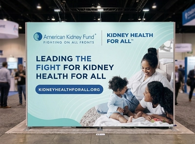
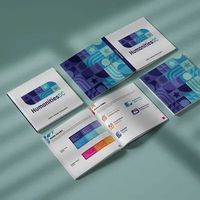
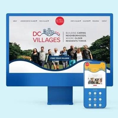
See how strategic branding actively supports market differentiation.
Explore Elxel Case Studies →3. The Mark Fails to Perform Across Modern Digital Platforms
An elite logo system must adapt flawlessly to every conceivable medium. A legacy logo drafted purely for print environments frequently crumbles under the demands of a responsive digital world.
Your logo must maintain extreme clarity across all touchpoints:
- 01High-density desktop and mobile website navigation headers
- 02Circular social media profile icons and mobile favicons
- 03Physical signage, architectural elements, and environmental design
- 04Minimalist presentation decks, digital proposals, and iconography
- 05Black-and-white print environments or embroidered corporate merchandise
If your logo loses legibility when scaled down to a smartphone screen, relies on microscopic details, or feels clunky within a square layout, it is actively bottlenecking your digital user experience. Premium marks are built with absolute vector scalability in mind.
4. Competitors Look Significantly More Established
Occasionally, the catalyst for an identity overhaul isn't your own internal layout—it's the competitive landscape around you.
When buyers evaluate service providers side-by-side, they compare brand authority. If your industry peers have invested heavily in cohesive, luxury brand identity systems while your visuals remain stagnant, your business will naturally appear less credible. A premium logo should effortlessly command confidence, reinforce internal expertise, and command price elasticity—never invite doubt.
5. The Graphic Disconnects From Your Brand Personality
A world-class logo shouldn't merely be an aesthetic graphic element; it must serve as an immediate visual translation of your corporate ethos. As agencies and enterprises mature, their internal personalities become distinct and structured. They lean heavily into becoming:
- 01More sophisticated and premium
- 02More innovative and technically disruptive
- 03More authoritative and market-enduring
If your visual assets reflect a corporate personality that no longer matches the lived experience of your clients, an identity correction is required. The most potent logos feel seamlessly intertwined with the overarching brand story.
Strategic Pivot: Logo Refresh vs. Logo Redesign
You do not always need to discard your entire visual history to modernize. Protecting your established brand recognition is critical.
Logo Refresh
A tactical modernization of existing assets. The core concept remains untouched, but the execution is polished.
- 01Key Inclusions: Subtle typographic updates, color palette optimization, simplifying overly intricate shapes, and improving responsive legibility across digital applications.
- 02Best For: Brands with massive existing market equity whose core structure is fundamentally sound.
Logo Redesign
A profound structural rethink of the entire visual system from the ground up.
- 01Key Inclusions: Crafting entirely new conceptual directions, establishing modern visual systems, executing complete re-positioning, and engineering holistic brand identity frameworks.
- 02Best For: Organizations navigating major mergers, massive market shifts, or businesses seeking to completely reposition themselves upmarket.
FAQ — Modern Visual Identity Strategy
How often should an established corporation redesign its logo?
While there is no rigid temporal rule, premium brands typically audit and evaluate their visual identity systems every 5 to 10 years. This rhythm aligns with major institutional growth milestones, technical platform evolutions, or fundamental shifts in target audience behaviors.
Can updating a logo damage our existing market recognition?
Not when managed by an experienced design agency. A strategic logo redesign captures the most identifiable, historically equity-rich pillars of your mark and elegantly re-engineers them into a modern context, maintaining continuity while signaling institutional evolution.
What distinguishes a logo refresh from a complete corporate rebrand?
A logo refresh modifies surface-level graphics and visual assets. A holistic rebrand begins at the foundation—re-engineering corporate positioning, internal values, messaging frameworks, client-facing tone of voice, and the entire visual identity matrix.
Is our logo truly that important to overall business growth?
Your logo is not your entire brand, but it serves as the ultimate anchor point for your corporate reputation. It is your introduction, your signature, and your most frequent visual touchpoint. A pristine logo sets the standard for your entire customer journey.
Final Thoughts: Visual Equity Commands Value
Your visual identity must evolve in tandem with your business scale. If your logo feels chronologically dated, operationally restrictive, or detached from your internal positioning, continuing to use it actively leaves money on the table. The objective of an identity shift isn't merely cosmetic—it is an investment to build a visual framework that perfectly matches the high-tier value and expertise your organization delivers.
Let's build a visual identity system that matches the true scale of your organization. Explore our branding services or contact our strategy team today to discuss engineering a powerful, enduring logo system for your business.
Explore Branding Services →