Design
Diamond Care Transportation
Out with the old. In with the trustworthy.
A Medical Transportation Logo Redesign Built on Care
Nobody books a medical ride because of a logo. But when someone you love needs a safe ride to dialysis, physical therapy, or a follow-up appointment, you notice every detail, starting with the van that pulls into the driveway. Diamond Care Transportation provides non-emergency medical transportation (NEMT) across the Washington, DC metro region, including stretcher, wheelchair-accessible, and non-emergency medical rides. Their team was already delivering the kind of care patients and families remember. Their brand just wasn't saying so. We partnered with Diamond Care on a complete rebrand: a new custom logo, a full brand guide, service sub-logos, and custom van wraps built to earn trust at the curb.
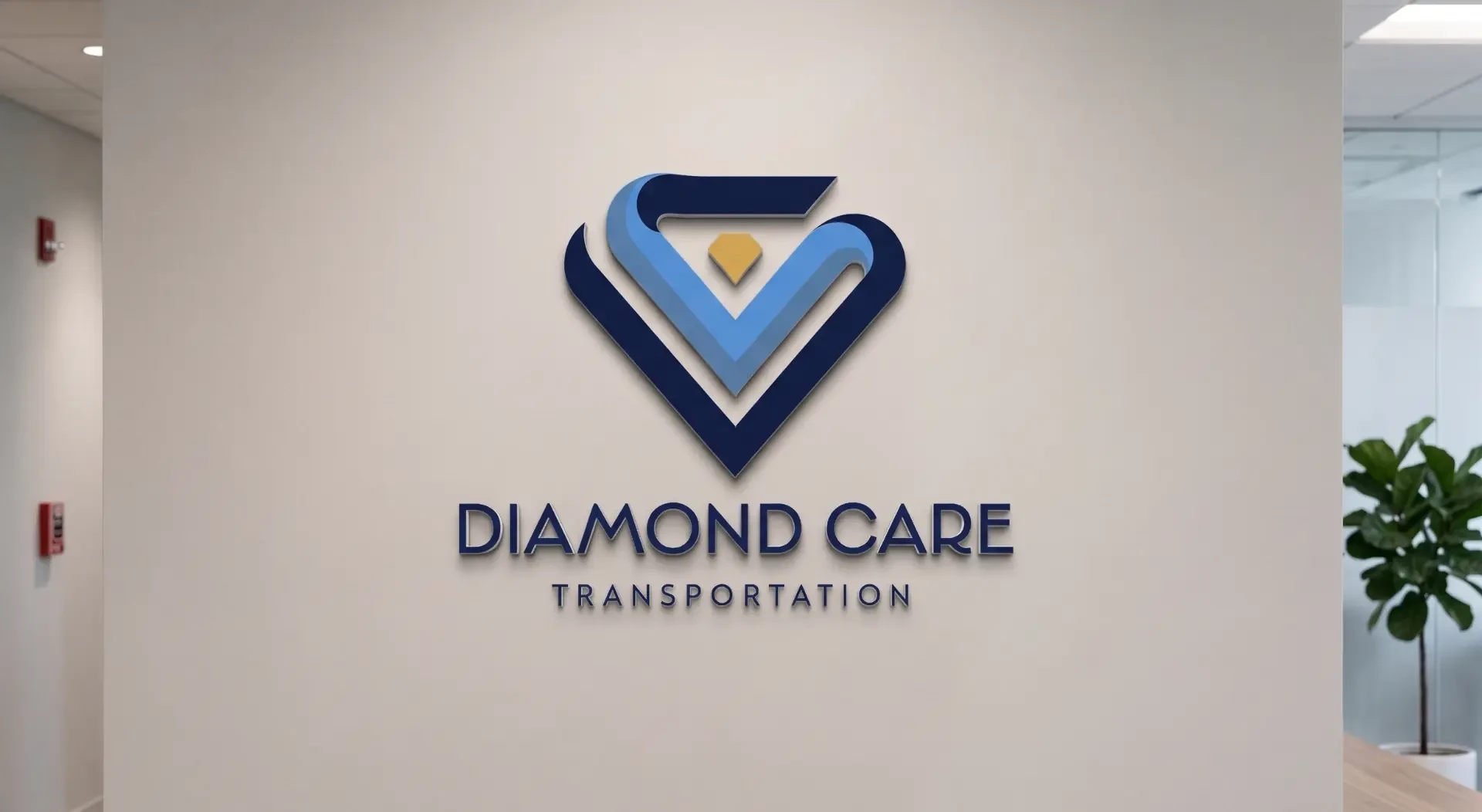
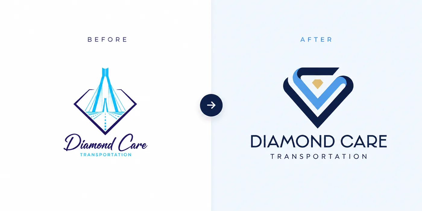
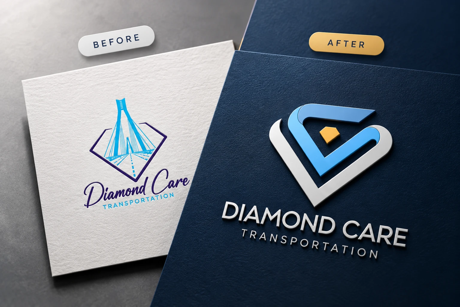
The original Diamond Care logo had heart. It also had a detailed bridge illustration, thin script lettering, and a lot going on for something that needs to be read from across a parking lot. It got lost at small sizes and was tough to reproduce on vehicles, signage, and uniforms. So we started over. The new logo combines a diamond with a heart, drawn as interlocking ribbons that feel like a road in motion, with a small gold gem at the center. It's bold, simple, and easy to recognize whether it's on a lobby wall, an embroidered polo, or the side of a moving van. Most importantly, it finally looks like the company behind it: professional, dependable, and caring.
One brand. Every service.
Brand Guidelines That Keep Every Touchpoint Consistent
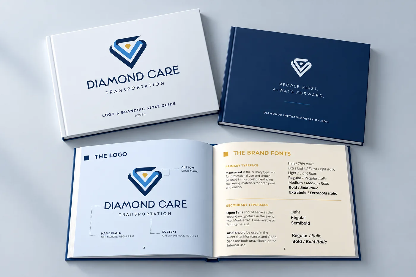
A logo is only one piece of a brand. To keep Diamond Care looking consistent as it grows, we built a complete brand guide covering logo usage, color palette, typography, and a family of sub-logos. The "we do care." logo swaps the gem for a small red heart and pairs it with the company's tagline, for moments that call for a warmer, more human touch. We also designed service logos for Stretcher Services, Non-Emergency Medical, and Wheelchair Accessible transportation, each with its own accent color. Patients, families, and healthcare partners can tell the services apart at a glance, and the team never has to guess which version to use.
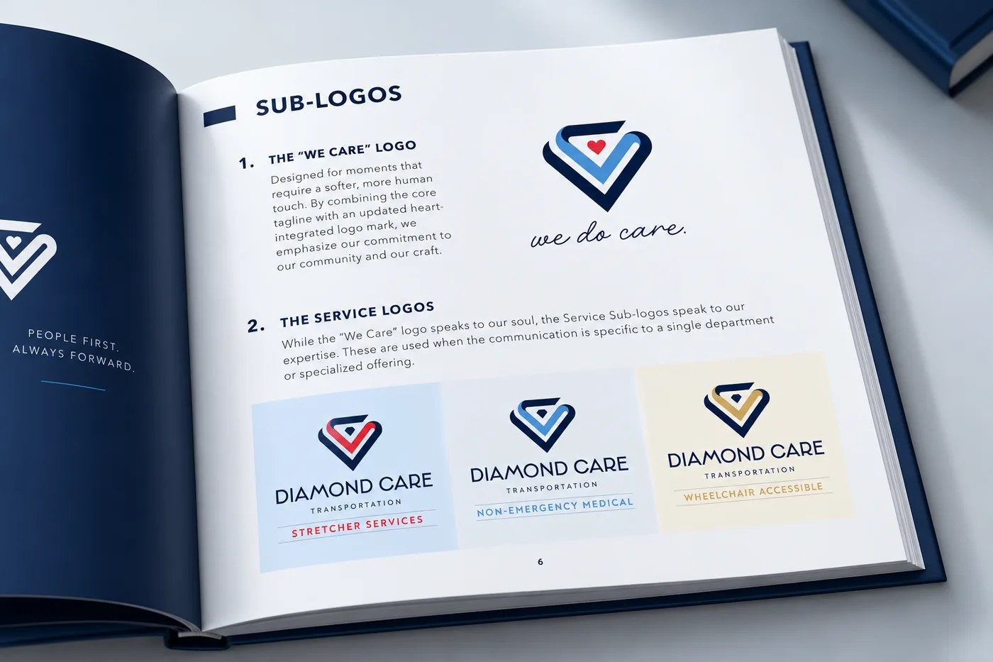
Trust is built in small moments.
Bringing the New Healthcare Brand to Life
Trust doesn't come from one great piece of design. It comes from dozens of small moments that all feel like they belong together. With the new identity in place, we carried it into Diamond Care's everyday touchpoints, from dimensional lobby signage to embroidered team polos featuring the "we do care." logo. Same colors. Same typography. Same logo system. Whether someone is walking into the office or being greeted by a driver at their front door, it's clear they're in the hands of one organized, professional team.
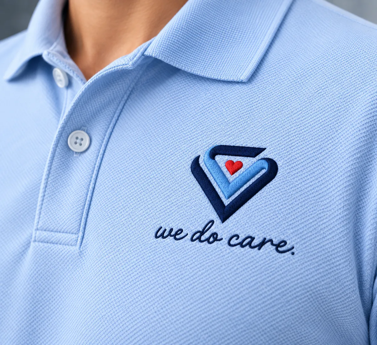
First impressions happen at the curb.
Custom Van Wrap Design for an NEMT Fleet
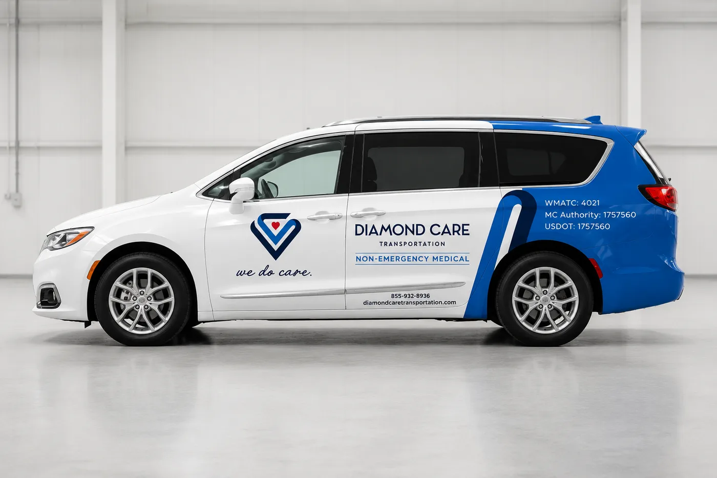
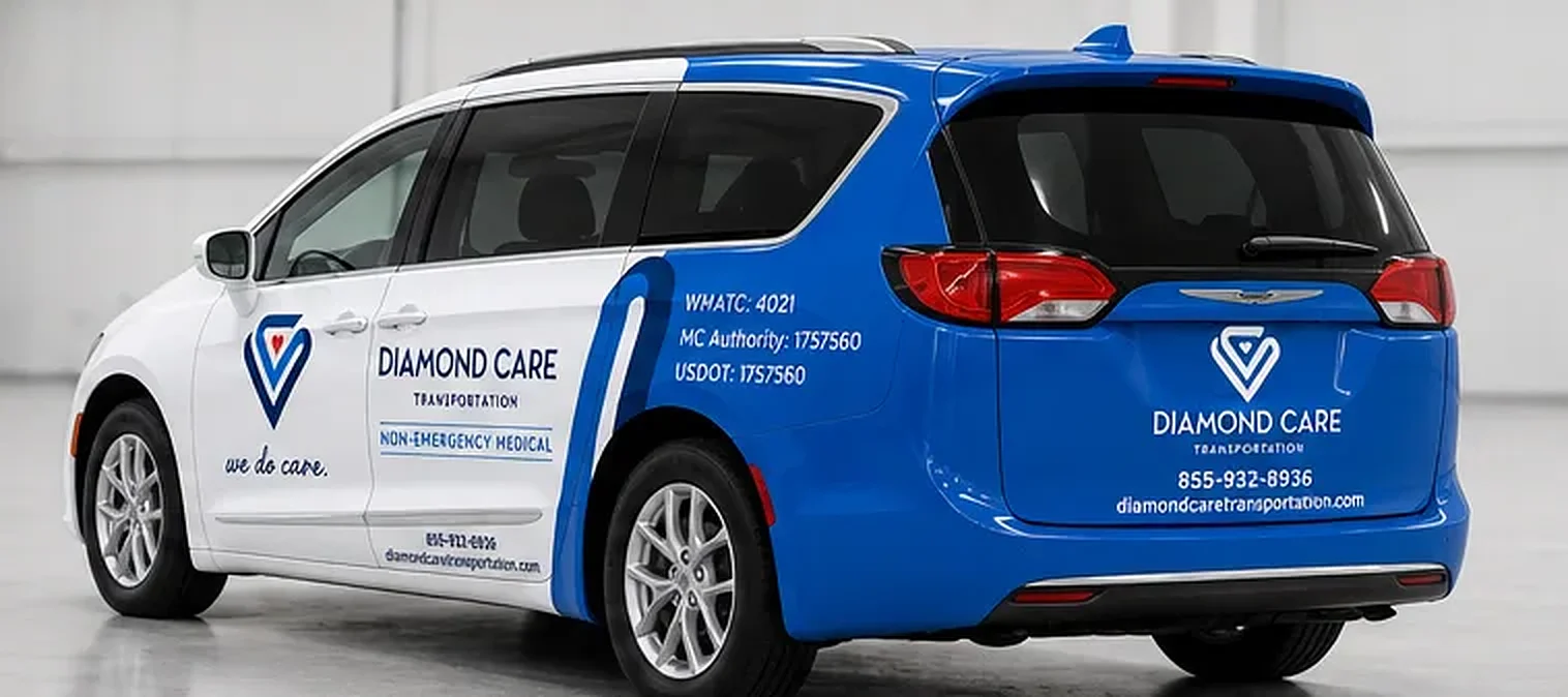
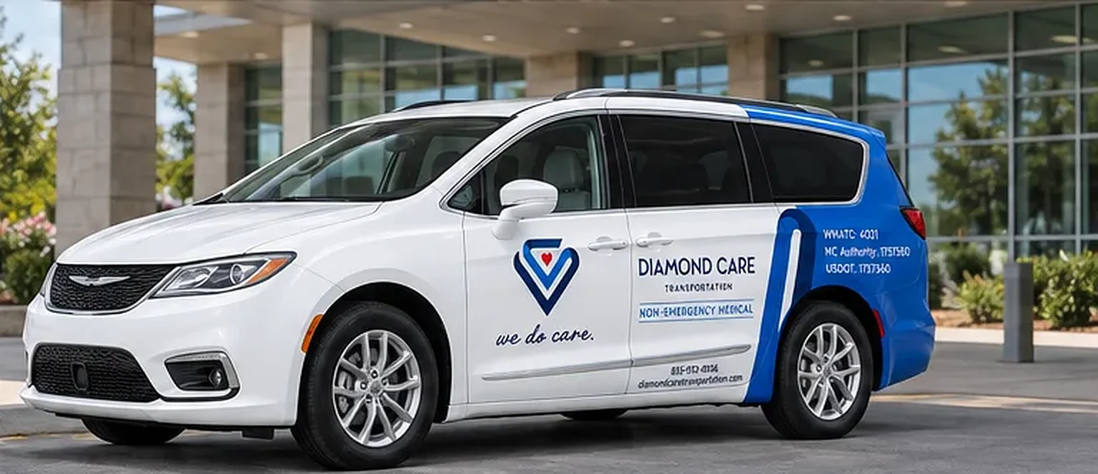
For a lot of patients, the van pulling up is their very first impression of Diamond Care. That moment matters. A clean, confident vehicle says "you're in good hands" before the driver ever steps out. We designed custom van wraps that keep the front of each vehicle crisp and white, with the "we do care." logo on the front door and the Non-Emergency Medical service logo on the sliding door. From there, a bold navy and blue sweep carries the brand all the way around the back, where the logo, phone number, and website are easy to read from the road. The rear quarter panel keeps the required WMATC, MC, and USDOT numbers clear and compliant. Every van is now both a trusted ride and a moving billboard for the business.
The Result
A Brand Patients Can Trust on Sight
Diamond Care Transportation now has a brand that matches the care its team delivers every day. The new logo works everywhere it needs to, the brand guide keeps everything consistent, and the fleet is instantly recognizable on the road. Nobody will remember every detail of the logo. But patients and families will remember how it felt when a clean, professional Diamond Care van pulled up to the door. That's what great healthcare branding is really about. Ready for a brand that earns trust before the first hello? Let's talk.
Related Services
Selected results
More Work Like This
Design
American Kidney Fund
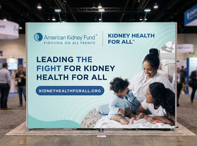
We partnered with the American Kidney Fund to design a cohesive event branding system that communicates impact, credibility, and compassion at scale. As a leading nonprofit supporting more than 35 million Americans living with kidney disease, their visual presence needed to reflect both authority and empathy across every touchpoint. Our team delivered strategic graphic design and environmental branding tailored for high-traffic events, ensuring consistency across booth design, printed materials, and promotional assets.
Design • Development
BookMe.com
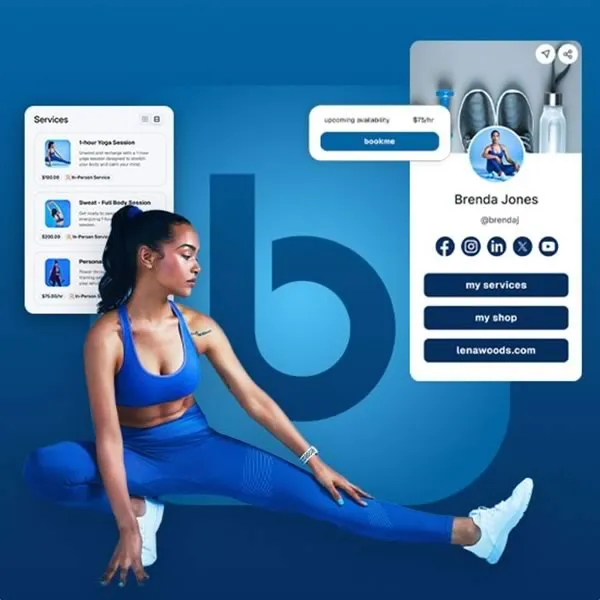
Bookme, an all-in-one booking and marketing platform, partnered with us to lead a complete brand and digital refresh. Our work included a refined & refreshed visual identity, modernized brand assets, and a comprehensive new brand guide to ensure a consistent look and feel across every touchpoint. Alongside the refreshed branding, we designed a custom website and mobile experience with an intuitive, user-focused interface.
Design • Development
DC Arts & Humanities Education Collaborative
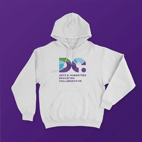
We partnered with the DC Arts and Humanities Education Collaborative (DC Collaborative), a member service organization dedicated to strengthening Washington, D.C.'s creative and educational community, to reimagine their brand and digital presence. From a geometric logo system symbolizing the organization's core pillars to a refreshed color palette, subsidiary program branding, and a fully redesigned website, every element was crafted to better serve their network.
Let's build it
Create Results Like This
Start a project with the same services we used here. We typically respond within one business day.