Brand Refresh & Visual Identity System
Standard Communities
Overview
Refreshing a Modern Real Estate Brand
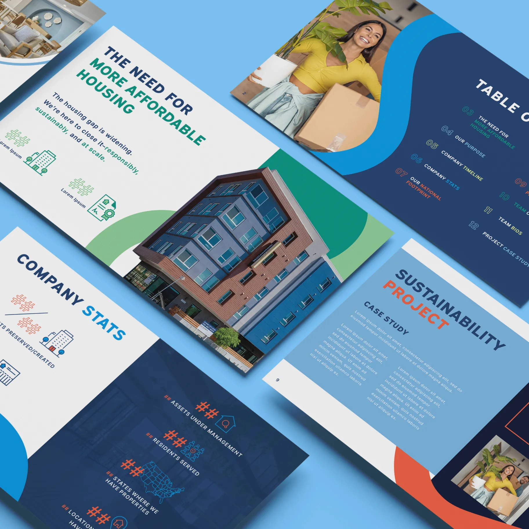
We partnered with Standard Communities to evolve and modernize their existing brand identity while preserving the core elements that made it recognizable. As a national real estate investment and development firm focused on affordable housing and community-driven projects, their brand needed to reflect both professionalism and purpose. Our team delivered a comprehensive brand refresh, expanding their visual identity system to better support marketing, presentations, and internal communications at scale.
Standard Communities came to us with an established brand foundation that needed to evolve. We expanded and modernized their visual identity system to better reflect their position as a national leader in affordable housing and community-driven real estate development—maintaining recognition while elevating consistency and impact across every touchpoint.
The Challenge
Evolving Without Losing Brand Equity
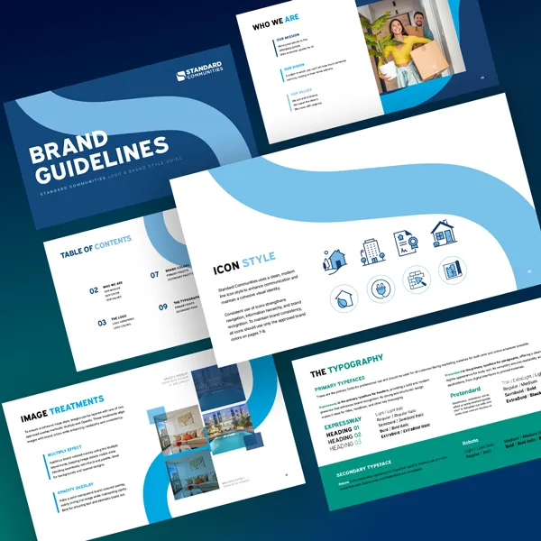
Standard Communities had an established brand foundation, but their visual system lacked flexibility, consistency, and distinction across touchpoints. A limited color palette restricted creative applications, typography and visual hierarchy were inconsistent, there was no defined iconography or graphic system, and brand materials didn't fully reflect their mission or industry leadership. The goal was to elevate the brand without losing recognition—modernizing the system while maintaining continuity.
Our Approach
Strategic Brand Refresh & Identity Expansion
We approached the project as a strategic brand evolution—refining and expanding the existing identity rather than replacing it. We expanded the color palette to increase flexibility and visual depth, selected and implemented updated typography for improved clarity, developed a refined imagery style aligned with their audience, designed a custom icon system tailored to real estate and community development, and created a cohesive graphic language to unify all brand touchpoints. Every element was designed to work together as part of a scalable, future-ready brand system.
Execution
Brand Guidelines, Presentation & Culture Deck
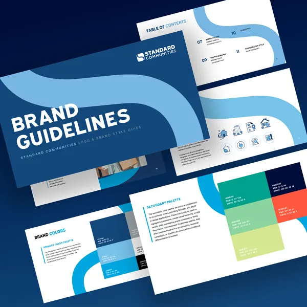
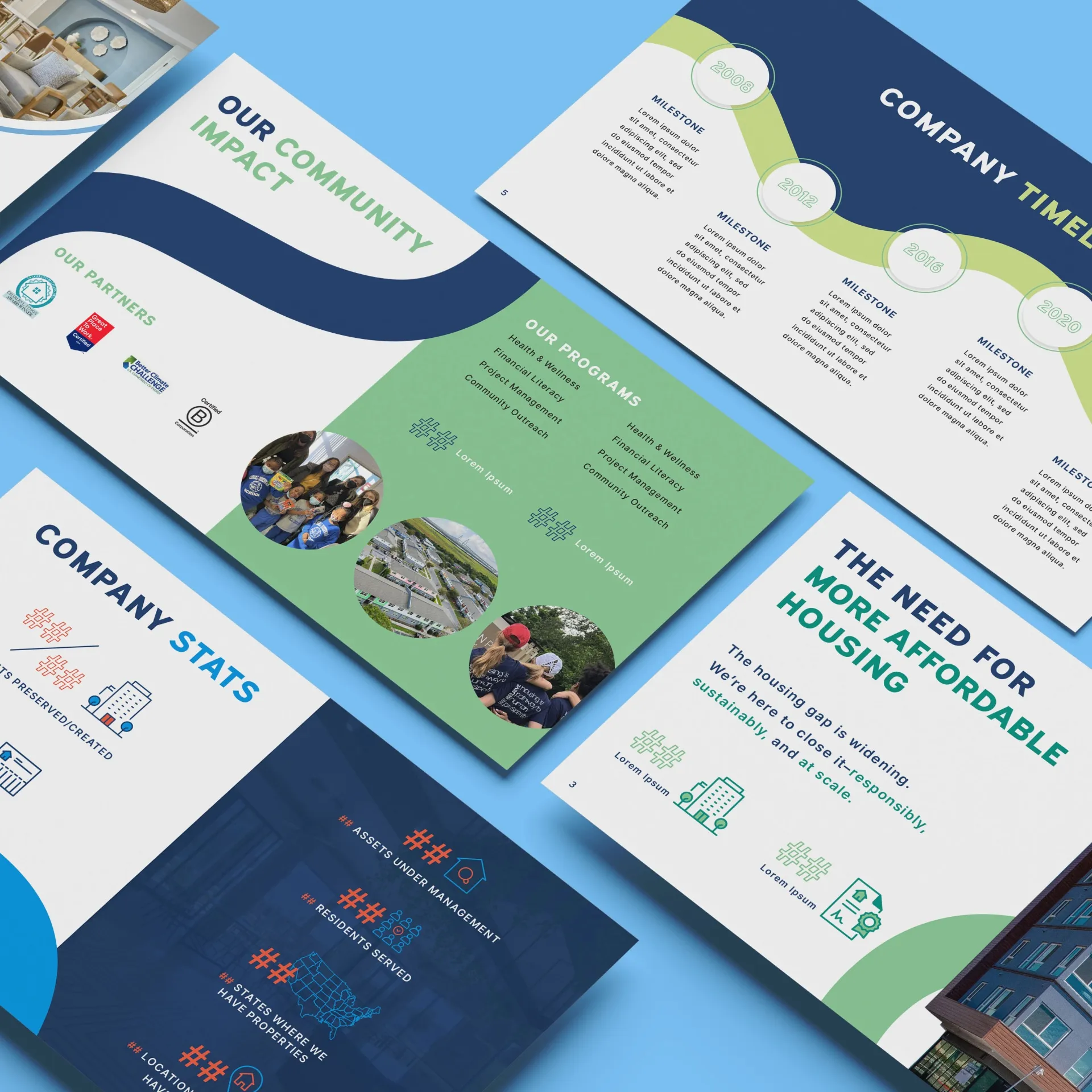
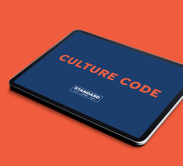
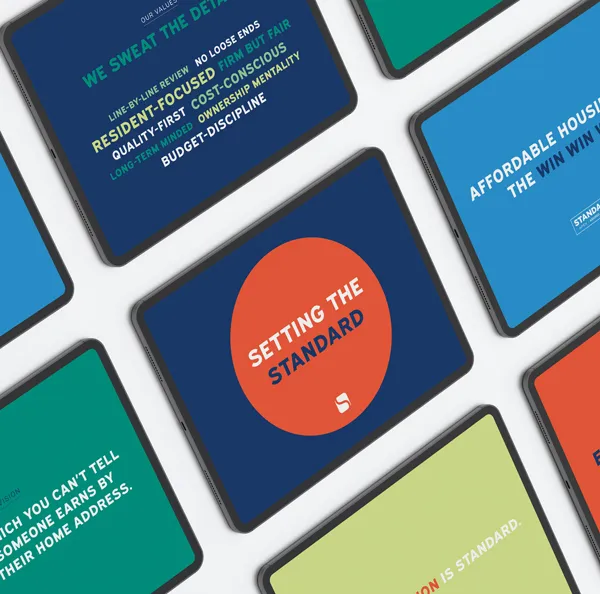
We translated the refreshed identity into a complete set of brand assets and tools: a comprehensive brand guidelines book outlining visual standards and usage, a custom presentation template for internal and external communications, a culture deck designed to express brand voice and company values, a fully custom icon set unique to their industry, and supporting visual assets for marketing consistency. These deliverables ensured the team could confidently apply the brand across all platforms.
The Result
A Scalable, Cohesive Brand System
The refreshed brand identity provided Standard Communities with a more flexible, consistent, and modern visual system. The updated brand strengthened consistency across presentations and marketing materials, improved clarity and professionalism in external communications, and better reflects their position within the real estate and affordable housing sector. Most importantly, the new system gives their team the tools to scale their brand effectively—supporting continued growth while staying aligned with their mission and values.
Related Services
Selected results
More Work Like This
Design
American Kidney Fund
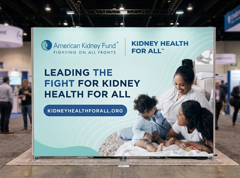
We partnered with the American Kidney Fund to design a cohesive event branding system that communicates impact, credibility, and compassion at scale. As a leading nonprofit supporting more than 35 million Americans living with kidney disease, their visual presence needed to reflect both authority and empathy across every touchpoint. Our team delivered strategic graphic design and environmental branding tailored for high-traffic events, ensuring consistency across booth design, printed materials, and promotional assets.
Design • Development
BookMe.com
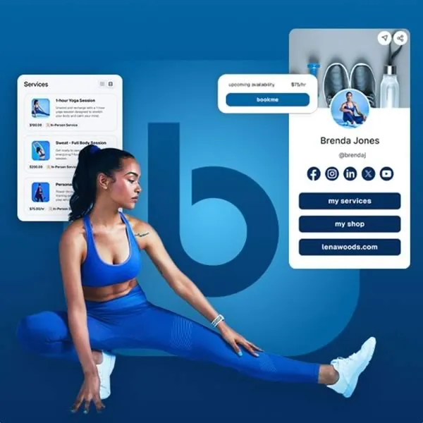
Bookme, an all-in-one booking and marketing platform, partnered with us to lead a complete brand and digital refresh. Our work included a refined & refreshed visual identity, modernized brand assets, and a comprehensive new brand guide to ensure a consistent look and feel across every touchpoint. Alongside the refreshed branding, we designed a custom website and mobile experience with an intuitive, user-focused interface.
Design • Development
DC Arts & Humanities Education Collaborative
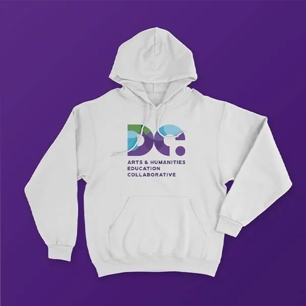
We partnered with the DC Arts and Humanities Education Collaborative (DC Collaborative), a member service organization dedicated to strengthening Washington, D.C.'s creative and educational community, to reimagine their brand and digital presence. From a geometric logo system symbolizing the organization's core pillars to a refreshed color palette, subsidiary program branding, and a fully redesigned website, every element was crafted to better serve their network.
Let's build it
Create Results Like This
Start a project with the same services we used here. We typically respond within one business day.