Healthcare Trade Show Booth Design: What Works and What Just Takes Up Floor Space
By Brittany Hill, Partner, Creative Director · November 20, 2026
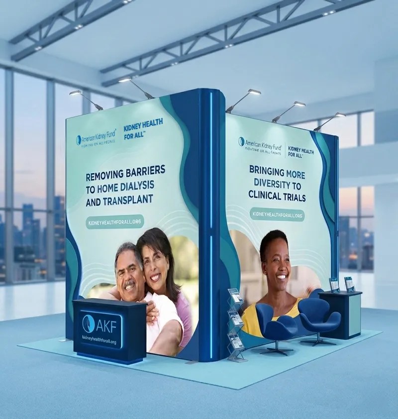
Walk any big conference hall and you'll notice something a little funny: a lot of smart, well-funded healthcare organizations end up with a healthcare trade show booth that looks exactly like the one next to it. Same pale blue, same stock photo of a smiling stethoscope, same wall of tiny text about being "committed to better outcomes." Everyone is trying to look trustworthy, and somehow it comes out as wallpaper.
A good booth doesn't need to be bigger or louder. It needs to be clearer. Here's how we think about healthcare event branding, and what's worth your budget and your floor space.
Trade show booth design starts with the room, not the mockup
Most trade show booth designs get approved on a laptop, up close, in good light. They get seen in a hall with mixed lighting, a lot of foot traffic, and people who are mid-conversation and looking for a restroom or a coffee line. Those are very different conditions.
Before anyone picks fonts, think through where people will see your booth from, how far away they'll be, and how long they'll actually look. Scale, contrast, and hierarchy matter more than detail. If a design only works at arm's length, it only works for the three people who've already walked up.
One message on the wall, everything else in their hands
This is the single biggest fix we see for healthcare and nonprofit booths. Organizations that do important work want to say all of it, so it all goes on the signage: mission, programs, stats, a tagline, a QR code, and logos from every partner.
Pick one idea for the wall. Make it big enough to read from across the aisle and short enough to take in at walking speed. Then put the detail where people can pick it up and read it later: a one-page flyer, a program book, a short brochure. Signage gets attention. Print gets understanding. Asking the wall to do both is how booths end up crowded and forgettable.
| On the wall (signage) | In their hands (print) | |
|---|---|---|
| Job | Gets attention from across the aisle | Builds understanding once they stop |
| Message | One idea, in a few words | Mission, programs, stats, and details |
| Read | At walking speed, from a distance | Later, at their own pace |
| Examples | Backwall, banners, counter graphic | One-page flyer, program book, short brochure |
Healthcare booth design that looks credible and approachable
Healthcare branding has a built-in tension. You need to look authoritative, because people trust you with serious information. You also need to look warm, because plenty of the people walking by may be worried, tired, or dealing with something personal.
Lean too clinical and the booth feels like a hospital hallway. Lean too casual and it loses credibility. A few things tend to help:
- 01Plain language over jargon, especially on the wall
- 02Real people and real imagery instead of generic stock
- 03Color and type that feel considered, not default
- 04Open, uncluttered layouts that feel inviting instead of institutional
For the wording itself, the federal plain language guidelines are a free, practical reference.
Plan for review and for people
Healthcare messaging often has to go through legal, medical, or compliance review, and that takes time you can't compress at the last minute. Work backward from the show date and build in room for approvals before design and print production, not after.
Also think about who's walking up. Make sure there's room for wheelchairs and mobility aids to approach comfortably, keep type large with strong contrast, and offer something to sit on if conversations tend to run long. The 2010 ADA Standards for Accessible Design are a good reference for clear floor space and counter heights. These are small choices that make the booth more welcoming to the people you're there to serve.
Treat your trade show booth as one piece of an event branding system
A booth isn't a standalone object. People will see your banner from the entrance, pick up a flyer at the table, flip through a program book later, and maybe see the same colors on a website or email a week afterward. If those pieces don't look like they belong together, you lose the recognition you're paying for.
You also don't always need a new brand to make this work. We did this recently for the American Kidney Fund, which already had a logo and identity. The job was designing a cohesive event system with large-scale signage, environmental graphics, and print collateral that showed the existing brand in a more inviting way, on a quick timeline. If you're curious, the American Kidney Fund project is on our site. The same thinking applies to any healthcare organization heading into a conference season.
If you're also planning the promotional side of an event, here's how we approached a national summit on a six-week timeline.
Common questions about healthcare booth design
How much text should go on a trade show booth?
Less than you think. Aim for one clear message on the main signage that can be read from a distance, and move supporting details to printed materials people can take with them.
What materials does a healthcare organization need for a conference?
At minimum: booth graphics and signage, printed collateral like flyers or brochures, and consistent branding across anything attendees will take home. Larger events may also call for program book ads, environmental graphics, and engagement pieces.
How far ahead should we start designing?
Earlier than feels necessary. Design, review and approvals, and print production all take time, so work backward from the show date and leave extra room for approvals.
Do we need a new brand for event design?
Not necessarily. An existing brand can look completely different in a convention hall if the layout, scale, and hierarchy are designed for that environment.
What makes healthcare event branding different?
The audience is trusting you with health information, so clarity and credibility matter more, and messaging often requires review. It also has to feel human, not clinical.
Try This
Print your current booth graphic, or pull up a photo of it, and tape it to a wall. Walk to the far end of the room and squint. Whatever you can still read from there is your real message. If it isn't the one you'd choose, that's the brief for your redesign.
One Last Thought
A booth works when someone gets the point of it in the few seconds they give it. Everything else is what the printed materials and the conversation are for. Design for the glance first, then make the follow-up worth their time.
Planning a conference season and want your healthcare organization to look as credible as it is? Our branding and design team designs booths, signage, and event materials from Washington, DC. Let's talk about your event. Thinking bigger than one show? Here's what a full healthcare rebrand includes, and why healthcare branding is really about trust.
Start a Project →Continue Exploring
Service
BRANDING & DESIGN
From bold brand identities to custom graphics with personality, we combine strategy, creativity, and functionality to create designs that make people stop and pay attention. Whether you need a full brand refresh, custom graphics, or scroll-stopping animations, let us help bring your unique vision to life.
Case study
American Kidney Fund
We partnered with the American Kidney Fund to design a cohesive event branding system that communicates impact, credibility, and compassion at scale. As a leading nonprofit supporting more than 35 million Americans living with kidney disease, their visual presence needed to reflect both authority and empathy across every touchpoint. Our team delivered strategic graphic design and environmental branding tailored for high-traffic events, ensuring consistency across booth design, printed materials, and promotional assets.
Next step
Start a Project
Tell us what you need. We typically respond within one business day.
Let's build it
Start a Project
If this article sparked a next step, tell us what you need. We typically respond within one business day.
Start a Project