YOUR CARE IS GREAT, BUT YOUR BRAND IS STILL WEARING THE OLD UNIFORM.
By Sammy Kassim · November 2, 2026
Healthcare organizations are famously bad at bragging. The care is excellent, the staff is devoted, patients send thank-you notes, and the logo looks like it was designed the same year someone first said "have you tried the internet?"
It's an easy gap to ignore, because the care is what people came for. But patients and families can't see your clinical standards from the outside. All they can see is the brand, and when it's tired, cluttered, or inconsistent, they quietly assume the care might be too. That's why healthcare rebranding is about trust, not decoration.
A rebrand that matched the care
Diamond Care Transportation provides non-emergency medical transportation across the DC metro region, including stretcher, wheelchair-accessible, and standard rides. Their team was already doing the kind of work patients and families remember. Their brand wasn't saying so.
The old logo had heart, but it also had a detailed bridge illustration and thin script lettering. At small sizes it got lost, and it was hard to reproduce cleanly anywhere that mattered, from signage to uniforms. So we didn't tweak it. We rebuilt the whole brand: a new custom logo, a full brand guide, and a family of sub-logos.
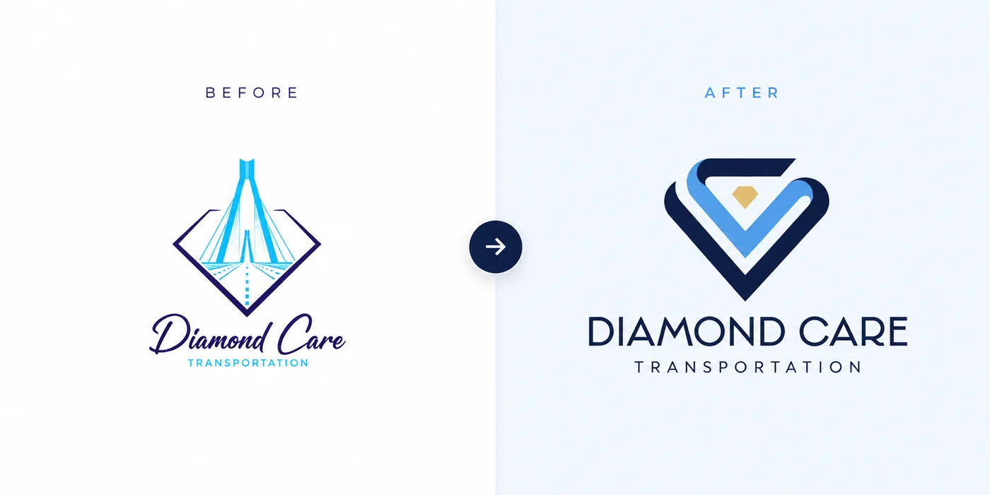
The new mark pairs a diamond with a heart, drawn as interlocking ribbons with a small gold gem at the center. It's bold, simple, and clear at any size. Most importantly, it finally looks like the organization behind it: professional, dependable, and caring.
What a healthcare rebrand actually includes
A rebrand isn't a new logo. If that's all you're being quoted, ask what's missing. A real one from a healthcare branding agency covers:
- 01The logo itself. Simple, readable at every size, and honest about who you are.
- 02Color and typography. The palette and fonts that make you recognizable before anyone reads a word.
- 03A brand guide. The rulebook for logo usage, color, and type, so the brand stays consistent as the team grows or changes.
- 04Sub-logos and variations. Alternate versions for different moments and services.
- 05The places it shows up. Signage, uniforms, forms, vehicles, your website, and everything else a patient touches.
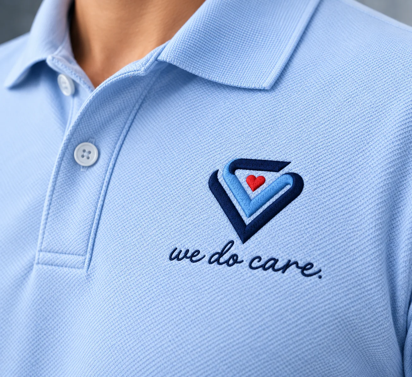
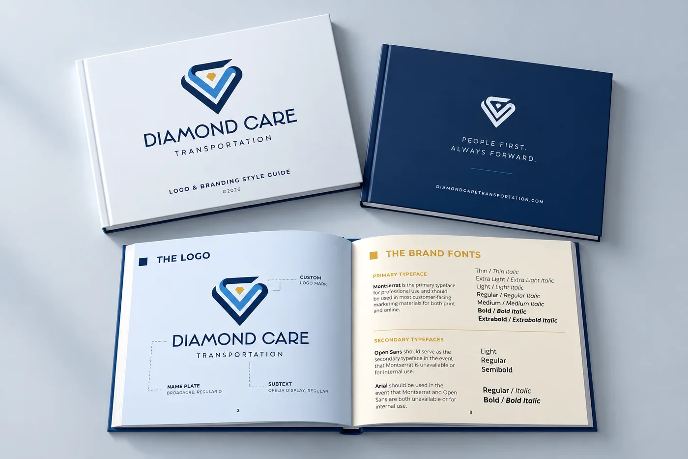
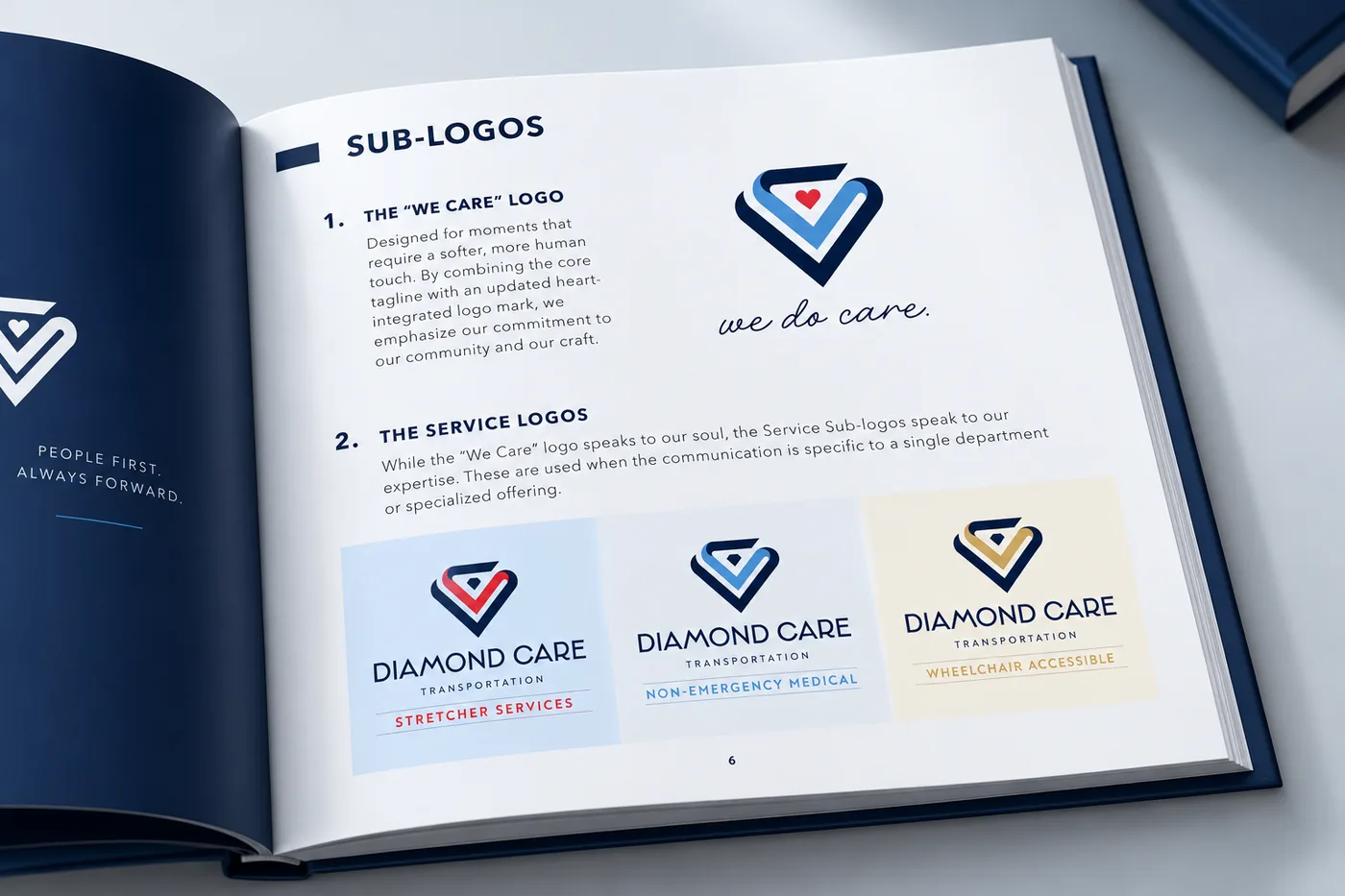
Diamond Care's brand guide covers the logo usage, color palette, typography, and sub-logos. It also includes a warmer "we do care." version, with a small red heart replacing the gem and a tagline added, for moments that call for a more human touch.
The sub-logo problem nobody warns you about
Most healthcare organizations don't offer one thing. They offer service lines, departments, or programs, and without a plan, each one drifts into its own look. Patients can't tell what's related. Staff improvise. The brand fractures.
Diamond Care got separate logos for Stretcher Services, Non-Emergency Medical, and Wheelchair Accessible transportation, each with its own accent color but clearly part of the same family. Patients, families, and healthcare partners can tell the services apart at a glance, and the team never has to guess which version to use. That works for a transportation company, and it works the same way for a clinic with several specialties or a care program with multiple offerings.
Then the brand goes to work
With the identity in place, we carried it into the everyday touchpoints: dimensional lobby signage, embroidered team polos, and custom vehicle wraps. Same colors, same typography, same logo system everywhere. Whether someone is walking into the office or being greeted at their door, it's clear they're dealing with one organized, professional team.
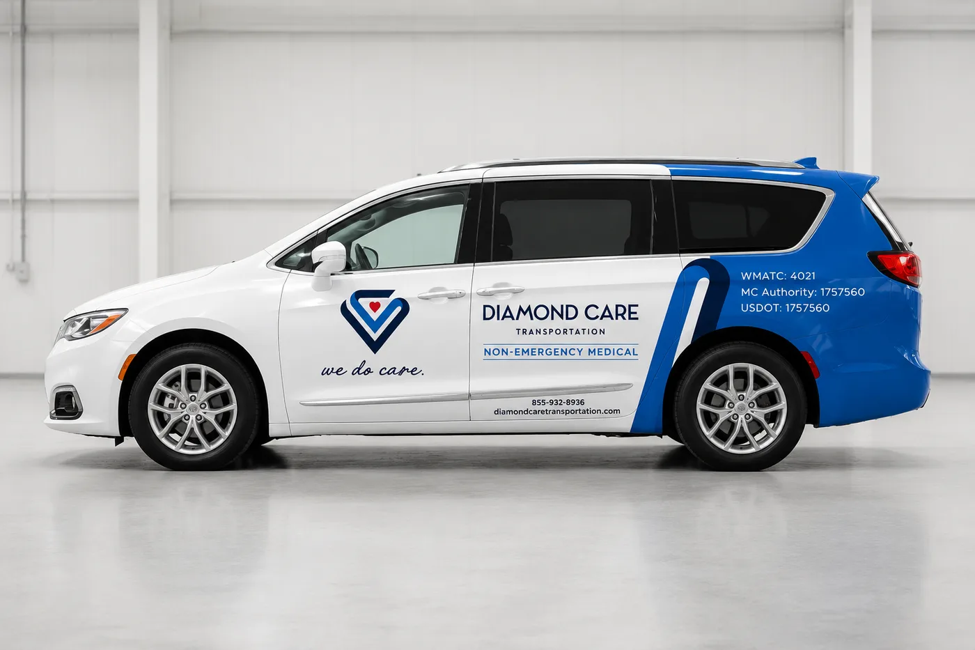
That consistency is what trust is made of. It rarely comes from one great piece of design. It comes from dozens of small moments that all feel like they belong together. We've written more about that in our post on building trust through healthcare branding.
Signs your healthcare brand is overdue
- 01Your logo falls apart when it's small, printed in black and white, or stitched on a shirt.
- 02Your materials look like they came from different organizations.
- 03Your service lines are confusing to people outside your building.
- 04Staff keep making their own versions of the logo or the flyer.
- 05The care you deliver feels a step above what your brand communicates.
One of these is a conversation. Three or more is a rebrand.
Quick answers, no waiting room required
When should a healthcare organization rebrand?
When the brand no longer reflects the care you deliver, or when inconsistency starts making you look less organized than you are. Growth, new services, and an outdated or hard-to-reproduce logo are common triggers.
What's included in a healthcare rebrand?
At minimum: a new or refined logo, color and typography, and a brand guide. Depending on your organization, add sub-logos for service lines and design for the places the brand appears, like signage and uniforms.
Does a healthcare rebrand apply to small practices and programs?
Yes. The scale changes, but the logic is the same: be clear, consistent, and recognizable wherever a patient or family meets you. Consistency also pays off as you grow, which we cover in why brand consistency drives business growth.
Try This
Gather everything with your name on it: your website, a printed form, an invoice, a staff badge, a sign, a business card. Lay it all out on one table and step back. Do they look like they came from one organization? If not, you've just found the real brief for a rebrand, and it cost you a few minutes and a lot of tape.
One Last Thought
A rebrand doesn't change the care you give. It just stops your brand from underselling it.
Running a clinic, practice, or care program whose brand hasn't caught up with its care? Let's talk about what a rebrand would include. Want to see the full Diamond Care identity, from logo to brand guide? Check out the case study.
Start a Project →Continue Exploring
Service
BRANDING & DESIGN
From bold brand identities to custom graphics with personality, we combine strategy, creativity, and functionality to create designs that make people stop and pay attention. Whether you need a full brand refresh, custom graphics, or scroll-stopping animations, let us help bring your unique vision to life.
Case study
Diamond Care Transportation
Nobody books a medical ride because of a logo. But when someone you love needs a safe ride to dialysis, physical therapy, or a follow-up appointment, you notice every detail, starting with the van that pulls into the driveway. Diamond Care Transportation provides non-emergency medical transportation (NEMT) across the Washington, DC metro region, including stretcher, wheelchair-accessible, and non-emergency medical rides. Their team was already delivering the kind of care patients and families remember. Their brand just wasn't saying so. We partnered with Diamond Care on a complete rebrand: a new custom logo, a full brand guide, service sub-logos, and custom van wraps built to earn trust at the curb.
Next step
Start a Project
Tell us what you need. We typically respond within one business day.
Let's build it
Start a Project
If this article sparked a next step, tell us what you need. We typically respond within one business day.
Start a Project